Starting my Cyberpunk project, I moved onto generating ideas and concepts that I stated in my proposal. I developed a production log that documented this process, and the work I planned on creating for that week. The purpose of this, is to track my progress, and clearly show how I’ve worked, and how my overall product has changed as I’ve moved forward.
Week Number & Date – Week 1: 04/11/2019-11/12/2019
When beginning my first week, my main priority was laying out an idea for the foundations of my work, including both the layouts of my city and weapon art concepts. I also needed to establish that my UCAS application was fully completed and ready to be sent off to universities. These areas will be my focus points throughout the week, and will allow me to continue with the further production of my project.
List of Tasks I plan on completing:
- Layout for Neon City
- Layout for Weapons Board
- Begin Creating building concepts and colour ideas
- Pay and finish UCAS application
Current Position – What did I do this week and why did I do it?
When drafting my building concepts, I began using my research, and specifically these set of images from my city and neon mood-boards. They both depict elements that I want to use for my city, such as the pink and blue lights, diorama layouts, and overall building appearance using my isometric art perspective. Additionally to this, I took a grid perspective template found in my art resources folder, as I wanted to generate initial concepts that were proportionately accurate, rather than trying to draw this myself, although I had a large range of research for reference, drawing my buildings in a 3D viewpoint, required me to ensure that was done correctly.


I then started my initial sketching of my buildings, I used my grid, and began experimenting with different shapes, signs, and styles, this process became much easier, as I wasn’t having to judge too heavily where the lines were suppose to be so that the perspective wasn’t skewed. Two of these buildings were made to resemble apartments, as these would populate around my city the most, as its where the people would be residing. The last was an experimentation, and was inspired by Japanese culture, seen in some of my research conducted on cities. I used google translate, so I could accurately include Japanese writing, that would mean something to my audience. My main issues with that, was trying to figure out which parts of my buildings were integrated within the building, or extruded out, as a technologically dominated society would have futuristic elements to their buildings structure for convenience, either dependent on its purpose, or acting as a light source.


I used a neon-cybernetic colour palette that features blue, pink, yellow, green and purple; as these are used to brightly present the advertisement that is used within this culture. Looking at my research, the walls of the buildings were mostly dark, as this made the neon much brighter, and blended well with the dark and dim lighting, which is heavily shown in Cyberpunk society. As mentioned in my proposal, I kept to vapor-wave colours, typically blue and pink, which worked well with my second design.

I changed the colour of the panels shown on the side of this building, as I wanted to see it to look as if this was emitting light. The problems with this, as it was too much light for one building, and the colours orange and yellow clashed immensely with the blue and pink schemes of the apartment windows. For this reason, I stuck with my original concept, where I will adapt this later to look as if the windows are more transparent.


I then drafted up some concepts for different structures, which I focused towards creating a more diverse scene. These buildings were made to look like factories, and industrial estates, rather than houses and apartments, as this added much more variety to my city, and gave me to opportunity to experiment with more colours. I wanted these buildings to look much more technical, as they would represent the higher class of civilization, even in the chaotic environment that is portrayed. I began noting some colour schemes that I believed would work well with its design, as its industrial, I pictured using greens and blue’s, as these are less natural, and used more for chemicals, something that would clearly symbolize a factory or industrial building that is high-tech functioning.

I again followed the same process and colorized my designs, I was quite happy with the colours I chose, as they fit well together, something that was important as these buildings would be combined within one scene. I realized while incorporating this that my first building looked slightly skewed and didn’t clearly fit the image I originally anticipated for, within my concept. So this will be something that needs to be adapted. I may consider blocking this building out, so I get the correct angle, and image reference for this type of layout I wanted. Additionally to this, I particularly liked the blue and green neon panels used for my third building, although they could be extruded downwards, to make this element look more 3D.

Once I had a couple of set concepts for my buildings, I began to put some together, to see what it started to look like, as if I had to manipulate the shapes. I also started to cut out elements of my buildings, and place them together, to create entirely new concepts rather than starting from scratch. Although this worked quite nicely, I needed to adapt some of them so they looked more unique from each-other. I was really aiming for a futuristic inspired environment, so it was acceptable to make the buildings as weird and wonderful as I wanted, experimenting with diverse shapes, colours, and sizes. I may consider enlarging some slightly, as many other concepts have quite a difference between their smallest and largest, whereas my concepts have a very small distance gap.
 Once my set of buildings were established, I began manipulating the colours of buildings I wasn’t sure on, here I created a set of colour ideas to see if I can adapt these within my city. For my first concept, I liked the pink and blue, although the pigment change made the building itself brown, which did not correspond to the colours of my walls in my city being typically dark. I may consider adding the last concept in, as its bright and bold, and the colour of the walls aren’t do diverse to fit my overall lighting. My apartment buildings worked really well with the colour changes, they contrasted well together, and most of them fit a colour pattern that could be used. The pink and yellow is a little too bright, and might stand out more, but the first and last colours create a nice neon glow, and is something I would consider using in my final piece.


Now that I was happy with the colours, I moved onto constructing the city in the format for my final presentation. I was pretty happy with this isometric view, and the buildings, once I manipulated and fitted them together, worked quite nicely with the overall depiction I was aiming for based upon my voxel city research. The ground was currently just a simple purple colour, which was inspired by one of my images within my research, as the platforms are usually quite simplistic and dark. Although I want to add some texture to the flooring, to make it look slightly more realistic and that the city has some depth and life-like rebel atmospheres and attitudes. Currently it was looking to simple and block-coloured, so I now needed to extend some detailing with shadows, shades and extra details.

I decided from here, that a technique I can use to make my colours look more neon, is using the gradients oval tool to create tones of lighting around the areas that supposedly use neon lighting. I tested this on some of the buildings exteriors and doors, and it really looked well with the effect I was aiming for. It was just enough to create a ‘glow’ type shine around, without it looking too over-top and drastic, as well as not too simplified or plain. The below images represent how the effect looked once it was completed throughout the whole city. I believe it really brought my artwork alive, and began to make it look like I intended towards the end product. To enhance the colours and bring out the vibrancy of this, I made the background pitch black, which again only brightened my concept.


Once my concepts were developed, I experimented using the motion blur and smart masks, put onto a screen layer, to create a misty rain effect. I set the motion blur to -65 to get a angle, and made it larger to look like rain. Although this turned out reasonably well, it saturated the colours, and made it stand out less, although I do like how it gives my city almost a pollution outlet, as this would be the case in a cybernetic world due to its computer domination, and use of technology as its primary source. I may try lowing the opacity, or moving the rain layer down, to only cover certain buildings, as this would make it look like its raining in certain areas, and might draw attention to some of the bolder and much brighter toned buildings.

What did I find difficult or easy?
What I found easy:
As I was using a grid, it made creating the perspective and 3D looking dimensions much quicker and more accurate than if I was drawing by eye, or using a layered reference image. If I chose to do it this way, my buildings would be out of proportion to each-other, and also at different angles, as well as just genuinely not being accurate. This way, all of them were already angled together, meaning all I had to worry about was style and design.
What I found difficult:
I found it difficult to design buildings that fitted a cyberpunk theme, I wanted them to look almost science fiction, but featuring more advertisement. Another element that was important was ensuring that it had enough light-source, as I wanted to make my buildings look rather neon occupation, meaning all of them had to have a large amount, otherwise some wouldn’t fit well with the others.
Planning for next week –
How do I plan to catch up:
Although I am on track with my self-given objectives, to keep on track, I need to ensure I keep enhancing the details on the buildings, and experimenting with different ways to improve quality.
Do I need to change anything about my work or planning:
I may need to work on improving my details on certain parts of my project, before moving forward within my tasks, I focus more on the development, rather than the final details of my work.
Week Number & Date – Week 2: 12/12/2019-19/12/2019
List of Tasks I plan on completing:
- Block-out designs to ensure my perspective is completely accurate
- redo my colours and glow neon effect using gradients
- Create Graffiti ideas
- Add weather details to city
Current Position – What did I do this week and why did I do it?
During this week, I was given constructive criticism by my tutor about my perspective on my buildings, although they were created well as I used the perspective grid. Some of my buildings were harder as some details fit between these lines, or didn’t match up properly, specifically with the balcony. For this reason, I used Maya to construct a block-out of my city, so I would get the correct proportions and angles. For this I took two screenshots, one from the side, almost in the exact angle of my original piece which highlighted some clear errors, like the amount of space left in the center. The good thing about using this technique, is it gave me the opportunity to look at my concept at potential perspectives I could use instead, as well as create different layouts for my design.


I tested out one of my buildings that I blocked out, as I wanted to make sure that the quality of my work would end up being better before I wasted time constructing the whole thing. I coloured out this design, and realized it was much better, as I not only got the angles correct, but the design itself was much cleaner as I wasn’t having to think about if the structure of where i’m placing my lines were correct.


I then outlined the entire city, by taking a screenshot of my block-out, and going over the lines. This took a long time, as the quality of the lines were poor due to how far away I had to take a screenshot from the model. I could have zoomed in, although as Maya is unable to save perspectives, all of the individual buildings would have been a different angle (which was one benefit of using the grid). To ensure this wasn’t a problem, I continued working with what I had, which once changed a few times, and corrected in certain places, turned out well, and looked much better and in proportion than my first attempt. The biggest improvement I believe is the gaps left between the buildings, as now you can clearly see which are in front and behind, and the gaps that the people would need in the city to function.

I re-coloured the buildings using the same colour schemes that I chose during my development process, although this time it was looking much cleaner, the lines were all the same width, and the colours looked much better as the building were not fully in-proportion. By this point I had to take consideration of time, as it was important I still kept on track with the development of my work, and time was noticeably lost due to re-doing what I’ve already created. Although I believe by this point that the end product is going to look much better than if I left my original concept as it was.

I was given suggestions by my fellow peers to add some graffiti to represent the youth and rebellion that would take place in a cyberpunk era. I liked this idea as it would add some more depth and detail to my building designs, and would represent the theme much more clearly. I used my research and gathered some further knowledge of Japanese culture, to look at the types of traditional colours, shapes and writing of graffiti artists. I came up with this first concept that was quite bright, the word itself means ‘neon’ in Japanese, which I thought was appropriate especially considering its chemical symbol abbreviation for the project ‘G10W CITY’. From this I generated multiple colour ideas, looking at overall vapor-wave schemes and other bold and bright colours that would fit well within my cities atmosphere.

My second design was much more stylized, as again I wanted it to almost look as if it could be created by a teenager or young person, typically dominating this period of time. Japanese were known for including vector type styles such as water droplets and using clean cut lines for symbols and words. For this reason, I kept this design quite clean. The colours were changed and adapted similarly to the first set of designs, and in similar colours. Although some were changed to fit the design better, such as using a yellow and pink rather than yellow and blue. Neon is again the chosen word as it fits the design nicely, although I may consider creating more with other words that spell out ‘revolution’ or ‘peace’, which would typically be used to represent an upcoming or current change to society.

I began including these designs and constructing them to my buildings. Which led to me focusing towards weather. I was given both the suggestion to add fog to represent a city of pollution, heavily governed by the mass of electricity and neon power that would be used. While others suggested rain, like my previous attempt. I wanted to test out both to see what worked best, beginning with fog. I really liked the effect of this, which was created using a tutorial explaining how to use the clouds filter, and then adjusting the levels from here. I added some clipping masks for ease, although this created a saving issue, as the file was limited to two gigabytes. Once fixing this, I believed the clouds really brought out the tone of the city, and made the glow effect look much more eerie, although I wan’t sure on how much it covered the colours and details of the buildings themselves; meaning I may have to tone this down if used.

I hid the fog effect and began creating the rain using a set of motion blur and adjusting the angle and amounts. I didn’t like how heavy I made the rain last time, so I toned down the amount of droplets, so it wasn’t too extreme, I liked this effect as it didn’t cover the details and shape of the buildings, although it was almost too subtle to effectively make a difference to my work.

As I liked both of these effects for their different aspects that it was adding, I tested combining them together, and lowering the fog amount so it wasn’t so extreme. I was really pleased with how this turned out, as it made the weather look really dreary and run down, which would be the effects of living in a computer dominated environment. It also made my artwork look much more completed, and gave it the extra details that would otherwise be lacking.

Now that I was happy with the overall environment, I wanted to move onto adding some texture to the floor, as it looked too simplistic for a large space, and made the negative space around the buildings much more visible. I began creating hand painted textures for ideas around this. My first design was basic brick, was turned out well, although didn’t look as if it fit properly within my concept piece. I used a cracked fiber over my design to give it a gritty affect, which worked well but again wasn’t right for this type of artwork which was traditionally rather clean throughout. My second was much more directed towards what I was aiming for, the colours matched it currently, and the cobblestone texture was clean yet still looked broken enough to be a type of flooring. I decided to pick this, and began applying it to my scene.


Once this texture was applied, I tried out different colours to make sure I selected the correct colour for the platform. I didn’t like the natural grey as it was too dark for my city, and the dark green didn’t contrast well with my colours on my buildings. I quite liked the lighter emerald green covered in fog, although I decided to stick with the original as it was more suited to the colours and style I was going for.
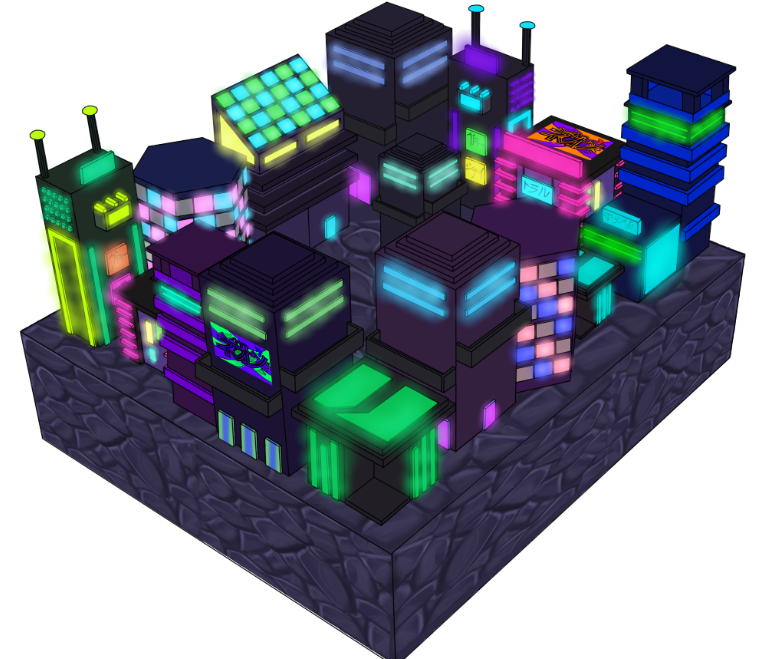


I then added an extension to my city for the streets and the street lights that will be added. I created a simple and current day road markings, although this did not look cyberpunk and set in the future. It was also really simple and left too much space in each corner of my street, making the diorama itself look too square.

I attempted something set more in the future, I wanted to create a neon type track, inspired by media such as WALL-E in the spaceships, and other science fiction media and imagery that shows electronically powered roads. The blue not only went well with the scene, but it made it look much more themed towards the neon and cybernetic environment.

Finally, I added a glow, which did work well in highlighting and surrounding the city. Although would be unrealistic, as cars and motorcyclists would not be able to see properly with such an extreme lighting. In addition to this, as stated in my proposal, I plan on adding street lighting, which wouldn’t be necessary with such a glow from the road track itself. Meaning I may consider removing this. I will continue the development of my city in further details later, and plan on moving my efforts towards my weapon design.

What did I find difficult or easy?
What I found easy:
I found designing and creating the weather and graffiti effects easy, as even though they were time consuming, I had a picture in my head of how and what I was creating, and I found this process really entertaining, meaning it wasn’t as much hard work. As I’ve also had much experience in my past study creating hand painted textures, this was also not complicated, as I new the process, and just had to apply it to what I wanted to create.
What I found difficult:
It was difficult trying to create an outline for my second draft for my city, as the line quality on my blockout was really unclear and not visible. Meaning in some areas I was having to guess where the lines were placed, making this counter-productive to my working rather than useful. Although this wasn’t a complete failure, as with persistence it did end up producing a better quality piece.
Planning for next week –
How do I plan to catch up:
I am on track and have completed my tasks set at the beginning of the week, I have actually ended up making more progress than anticipated during this production.
Do I need to change anything about my work or planning:
To continue staying on track, I have to keep consistent with my work-load, and keep updating my development blog to ensure that my work keeps up to the same level, and at a good time management.
Week Number & Date – Week 3: 19/12/2019-26/12/2019
List of Tasks I plan on completing:
- Create street light initial ideas
- Create Motorcycle initial Ideas
- Create photo-bashes of swords
- Create initial sketches and colour ideas for sword
- Create photo-bashes for gun
- Create initial sketches for gun
Current Position – What did I do this week and why did I do it?
Beginning my third week, I created initial sketches for street lights that will be placed along the street of my city. These designs were just made so I could get a general idea on what I could blockout when creating my final versions. My first design is quite old fashioned although would be effective to portray a dimmed lighting which is what i’m aiming for within my cyberpunk city. Whereas my second is much more traditional to the current modern era, and could be arguably futuristic is created using neon panels. The third and final designs were made to look much more science fiction, as they use unusual shapes and more far-fetched sources of power such as crystals and solar balls, possibly only found in fiction and in much later periods of time.

I then moved onto the production of my first sword. To do this I photo-bashed a range of images, and began a detailed outline, eventually adding my own details to the swords design. At first the swords handle was made to look pointed, although this gave it too much of a water theme, and also made it look unrealistic as this currently as no purpose. For this reason, I changed the handle and made it much similar, and decided that its use would be as a light powered source for my sword. Making it more hi-tech and much more realistic.


I coloured my designs, I quite liked the way all of them came out, specifically the yellow, as it stands out, and is true to the colour schemes of Japan. This one in particular was also changed via the colour balance, meaning the hue of the blade itself differs, which gives it a nice glow effect. I will consider adding a similar neon glow that was added to my city, as well as finalizing my designs in my later production.

For my second creation, I wanted this one to be rather unique, and consist of quite a heavy blade and handle. I photo-bashed two science fiction areas, and drew over the blade, making it slighter thicker. I knew I wanted the hand guard to have a different circular extension, so I used this as a guide to create four panels that extrude outwards. I wanted this to look like two of them were behind the ones in front.


I then again coloured them, the purpose of this was not to make them detailed, just to see what colours would work well with the style of the swords. I planned on introducing the shadows and lighting further down the production of the final weapons, so this was purely used for testing of colours and different scheme combinations. I quite liked the green blade with the blue lights, as well as the pink with the red, I believed these two really stood out, whereas the blue and orange sword didn’t look visually suitable for the intricate concept I went for. This sword definitely needs polishing up, such as blending in the black line-art, and ensuring everything is even where it needs to be.

My final design was a combination between a science fiction blade and Japanese katana. I really liked the shape of this blade, as it was more unique, I made the hand guard quite thick, which I believed worked well with this design, although I may need to make this smaller due to its impracticality. I outlined this and again used the same process to add my own details to the center of the blade and handle.


I coloured my designs, ensuring that the coloured remained consistent throughout, so they looked like a matched set. This weapon was designed to look rather science fiction, and the blades for this and my first sword are quite large to emphasize the differentiation between these and modern day weapons. I believe the light blue works well with this design style, and will be the one I will be designing further and adding shadows to for my final product.

I moved onto creating a gun, this was the most challenging as I decided not to photo-bash this design. rather use a single image and work my away around creating my own shape. After some time I developed this into a gun shape I was happy with, and moved onto changing some of the line details so that they fit the neon scheme I wanted. I finalized this outline with thicker black lines, and ensured they were reasonably neat to colour.


I kept to using a vapor-wave pink and blue, which worked really well with the gun design, especially contrasting with the light grey. I liked how smooth this weapon came out, and plan on making my weapons more like this towards the end of this product. I also plan on developing my swords so they look as smooth and clean as this concept piece. I manipulated the colours into different types of neon that I liked and thought worked well together. All of them came out really nicely, and I may consider using them for my final end display for this project as an asset to the final piece.


Finally, I created some war-hammers, these were created using a clean style. I decided not to use reference for this as a guide, and instead based my creation off of my past research of science fiction and cyber weapons. I was quite happy with this development, although they may need some more detail on the main body of the hammer, as well as the end of the handle, as currently they look too simple, even for this style. I once again manipulated the colours, and stuck to a traditional vapor-wave palette for the designs.

What did I find difficult or easy?
What I found easy: Photo-bashing and generating the colours for my designs. As they have mostly stayed similar for both the creation of my city and my weapon concept pieces. They also all stuck to a neon palette so I knew what I was aiming for.
What I found difficult: Trying to generate new and unique weapons using my photo-bashes, as I had to manipulate the center much more drastically then the outside of the weapons body.
Planning for next week –
How do I plan to catch up:
I missed out creating my motorcycles, so I may need to speed up so I can get this development stage out the way. Something I will finish later on this week.
Do I need to change anything about my work or planning:
Plan out the initial sketching beforehand before generating outlines, as this will make it easier to complete the final line-work rather than adapting it as you go.
